Posts

Showing posts from March, 2021

Unsupervised and Supervised Classification

Image
  This module taught us how to conduct supervised and unsupervised classification in ERDAS Imagine. I conducted a supervised classification of Germantown, Maryland. The distance image is also included to display the areas that vary spectrally from the rest of the image.  I created the supervised classification with the seed method. I selected the area I wanted to sample with the inquire cursor, then used the grow properties tool to create the sample polgyon. This sample was added to the spectral signature file. Once all of the image had signature samples, I classified the image. I also recoded the image to include the classifications listed above.   
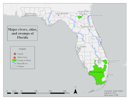
Map design

Image
 This week in my cartography course we learned about typography and map design. The goal of this module's exercise was to create of map of Florida that exercised our new knowledge about proper map design and develop our personal map making style. The main goal was to properly use and design labels in this map. The map of Florida was to include major rivers, cities, and swamps/marshes.  I used ArcGIS Pro to create this map and complete the exercise. The main tools I used within Pro was labeling, symbology, and annotations. I used the labeling tools to edit the format of my labels. I used symbology to select which features and labels were displayed. I used annotations to design and edit the labels in an easier format.  I chose to customize my map in three ways. 1) I changed my base map to "light grey map" but I removed the "light grey reference" layer that contained pre made labels. 2) I made the point symbol for the capital a star so it stood out from the other m...

Introduction to map cartography

Image
 The first assignment of my computer cartography course was to critique several maps, both good and bad. We were to critique their map elements, design, and layout. Included below are examples of a good and bad map that I found online. There is a synopsis included for both that discusses what is good and bad about each, what map principles they did well or missed, and the elements I liked or what they could have done better.  Good map: Overall, this map meets its objectives. It is a well designed and easy to understand map. The map is intended to be an index for the rest of the atlas. The design is clean, uses a consistent font and style, and makes good use of symbols. It effectively executes the principle of “effectively label maps” and “map substantial information.” The colors are also simple and make the distinction between each sub area clear. I appreciate the font used, the use of different colors to include lots of labels, and the map layout.  Bad map: This map incl...

Get to know me!

  Hello! My name is Emily Talbert. I am originally from central Alabama, but I am now living in Pensacola. I got my BA in anthropology from the University of South Alabama.  I am currently a MA student in historical archaeology and I am working on the Graduate GIS certificate.  This is my fourth GIS class and I am really enjoying it! I hope to use GIS in archaeology because it is an extremely relevant skill and very interesting. In my free time, I enjoy baking, spending time outside, and I have recently begun gardening.  Have a look at my StoryMap to learn more about me and some of my favorite travel destinations:  https://arcg.is/TafeO

Spectral Enhancements

Image
  This map identified feature 1, the bodies of water, using layer 4 in greyscale.  This map identified feature 2, the snow, using a multispectral True Color band combination. This map identified feature 3, the bay, using a multispectral NIR band combination. It shows the two water systems mixing in the bay.