Posts

Isarithmic mapping

Image
In this module, I learned about isarithmic and flow line mapping. We were assigned to create an isarithmic map with contours. The subject of the map is the annual precipitation in inches in Washington state.  This map was created in ArcGIS Pro. I created this map using data acquired from the USDA and created by PRISM. I adjusted the symbology of the raster file to use precipitation colors (dark blue to dark orange). This map includes 10 manually adjusted breaks, which can be seen in the legend. I then created contour lines that follow the same value breaks. I created a hillshade for this raster using the hillshade tool. I selected the DRA (Dynamic Range Adjustment) tool to adjust the hillshade to the local area. From here the raster layers were ready for a map layout, which I have included below.      

Choropleth and Dot mapping

Image
This module we were assigned to create a map that depicts the population density and wine consumption in Europe with a choropleth and dot map. This map was created in ArcGIS Pro. I created the choropleth element of the map with symbolized the map with graduated colors. I selected the "orange" color ramp and edited the lightest and darkest shade to better display the data. I gave it five breaks and used natural breaks.  I created the dot map that depicts wine consumption (liters per capita) by symbolizing the data with graduated symbols. I chose graduated symbols because it has classes, which makes it easier for the reader to interpret the data. I chose a dark red color that is reminiscent of wine. I also gave it 5 breaks and the quantile method. I chose this method because I think it did the best job of presenting the information.    

Data Classification

Image
In this module, we learned about the various methods of spatial statistics and data classification. For our lab assignment, we were told to create two maps that include the distribution of residents above 65 years old in Miami-Dade County.  The first map is a "Percentage of residents 65 years old and up in Miami-Dade." The data is the percentage of residents 65 years and older. It displays the data with four different classification methods: natural breaks, quantile, equal interval, and standard deviation.  The second map is the "Normalized distribution of residents 65 years old and up in Miami-Dade." This data is the number of residents 65 and older normalized with the area (square miles). It also displays the data in different classification methods: natural breaks, quantile, equal interval, and standard deviation.   

Cartographic Design

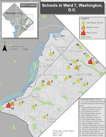
Image
In this module, we learned about cartographic design principles. Our assignment was to create a map of the schools Ward 7, Washington D.C. They needed to be symbolized by level (elementary, middle, and high school). While making this map I made sure to keep ward 7 and the school as the main focus of the map. The other map elements are subdued and serve as secondary elements. Please enjoy!

Unsupervised and Supervised Classification

Image
  This module taught us how to conduct supervised and unsupervised classification in ERDAS Imagine. I conducted a supervised classification of Germantown, Maryland. The distance image is also included to display the areas that vary spectrally from the rest of the image.  I created the supervised classification with the seed method. I selected the area I wanted to sample with the inquire cursor, then used the grow properties tool to create the sample polgyon. This sample was added to the spectral signature file. Once all of the image had signature samples, I classified the image. I also recoded the image to include the classifications listed above.   

Map design

Image
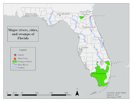
 This week in my cartography course we learned about typography and map design. The goal of this module's exercise was to create of map of Florida that exercised our new knowledge about proper map design and develop our personal map making style. The main goal was to properly use and design labels in this map. The map of Florida was to include major rivers, cities, and swamps/marshes.  I used ArcGIS Pro to create this map and complete the exercise. The main tools I used within Pro was labeling, symbology, and annotations. I used the labeling tools to edit the format of my labels. I used symbology to select which features and labels were displayed. I used annotations to design and edit the labels in an easier format.  I chose to customize my map in three ways. 1) I changed my base map to "light grey map" but I removed the "light grey reference" layer that contained pre made labels. 2) I made the point symbol for the capital a star so it stood out from the other m...

Introduction to map cartography

Image
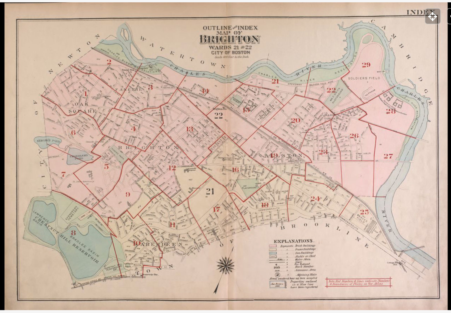
 The first assignment of my computer cartography course was to critique several maps, both good and bad. We were to critique their map elements, design, and layout. Included below are examples of a good and bad map that I found online. There is a synopsis included for both that discusses what is good and bad about each, what map principles they did well or missed, and the elements I liked or what they could have done better.  Good map: Overall, this map meets its objectives. It is a well designed and easy to understand map. The map is intended to be an index for the rest of the atlas. The design is clean, uses a consistent font and style, and makes good use of symbols. It effectively executes the principle of “effectively label maps” and “map substantial information.” The colors are also simple and make the distinction between each sub area clear. I appreciate the font used, the use of different colors to include lots of labels, and the map layout.  Bad map: This map incl...