Posts

Showing posts from April, 2021

Isarithmic mapping

Image
In this module, I learned about isarithmic and flow line mapping. We were assigned to create an isarithmic map with contours. The subject of the map is the annual precipitation in inches in Washington state.  This map was created in ArcGIS Pro. I created this map using data acquired from the USDA and created by PRISM. I adjusted the symbology of the raster file to use precipitation colors (dark blue to dark orange). This map includes 10 manually adjusted breaks, which can be seen in the legend. I then created contour lines that follow the same value breaks. I created a hillshade for this raster using the hillshade tool. I selected the DRA (Dynamic Range Adjustment) tool to adjust the hillshade to the local area. From here the raster layers were ready for a map layout, which I have included below.      

Choropleth and Dot mapping

Image
This module we were assigned to create a map that depicts the population density and wine consumption in Europe with a choropleth and dot map. This map was created in ArcGIS Pro. I created the choropleth element of the map with symbolized the map with graduated colors. I selected the "orange" color ramp and edited the lightest and darkest shade to better display the data. I gave it five breaks and used natural breaks.  I created the dot map that depicts wine consumption (liters per capita) by symbolizing the data with graduated symbols. I chose graduated symbols because it has classes, which makes it easier for the reader to interpret the data. I chose a dark red color that is reminiscent of wine. I also gave it 5 breaks and the quantile method. I chose this method because I think it did the best job of presenting the information.    

Data Classification

Image
In this module, we learned about the various methods of spatial statistics and data classification. For our lab assignment, we were told to create two maps that include the distribution of residents above 65 years old in Miami-Dade County.  The first map is a "Percentage of residents 65 years old and up in Miami-Dade." The data is the percentage of residents 65 years and older. It displays the data with four different classification methods: natural breaks, quantile, equal interval, and standard deviation.  The second map is the "Normalized distribution of residents 65 years old and up in Miami-Dade." This data is the number of residents 65 and older normalized with the area (square miles). It also displays the data in different classification methods: natural breaks, quantile, equal interval, and standard deviation.   

Cartographic Design

Image
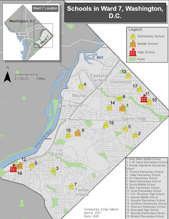
In this module, we learned about cartographic design principles. Our assignment was to create a map of the schools Ward 7, Washington D.C. They needed to be symbolized by level (elementary, middle, and high school). While making this map I made sure to keep ward 7 and the school as the main focus of the map. The other map elements are subdued and serve as secondary elements. Please enjoy!